Guidelines for creating good infographics are not hard to find. The guidelines generally cover some configuration of the following:
- Determine the goal of the infographic — what you want to communicate
- Analyze relevant data and determine which data sets are most important
- Design thoughtfully
And the graphical representation of data is often wonderful. It can significantly increase understanding, quickly communicate concepts, and create memorable information.
But with the recent explosion of infographics and tools for making infographics (see Easel.ly, Infogr.am, and BeGraphic, among others), most infographics have become worse than useless. Most of the infographics I’ve seen recently actually deter information acquisition.
So, here’s the “stick” guidelines to complement the “carrots”, above.
1. Land on a single message.
Consider We Are What We Eat.  There is likely really interesting information in this large, multi-page, occasionally interactive infographic. But it is impossible to find. There is too much, spread over too large an area. There is no consistent story.
2. Weed out most data.
In fact, if there’s a ton of data, you probably need an infoviz to showcase it, not a flat graphic. )The New York Times, which generally does a great job with data viz, creates a nice interactive with How Many Households are Like Yours?) Choosing the data to leave out is just as important as the data you leave in.
3. Keep it to one page.
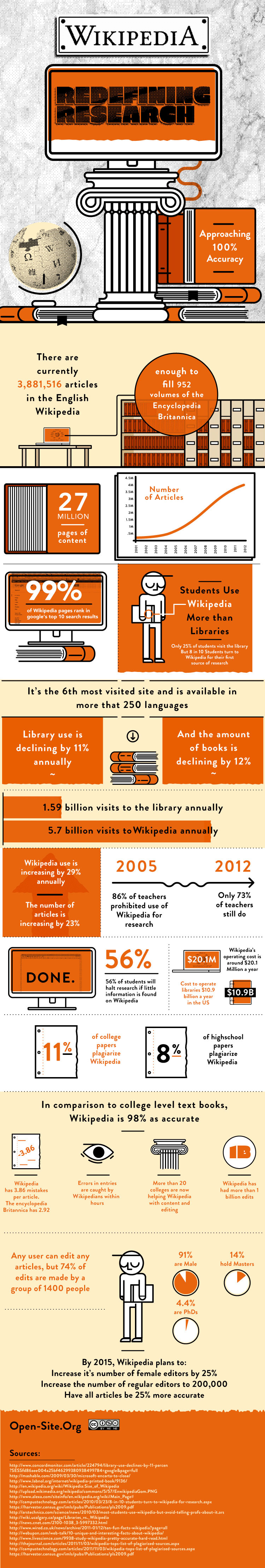
(Or a tiny bit more than one.) As a general rule, information should not require scrolling for multiple pages such as with this infographic on using Wikipedia for research. A single view is especially critical in an infographic, where communicating the overarching concept is undermined when users can’t see the entire page. Users need the forest and the trees.
Infographics should make information acquisition easier. They should not be a test of intellectual persistence.
Go forth and make good infographics.